Clay Construction

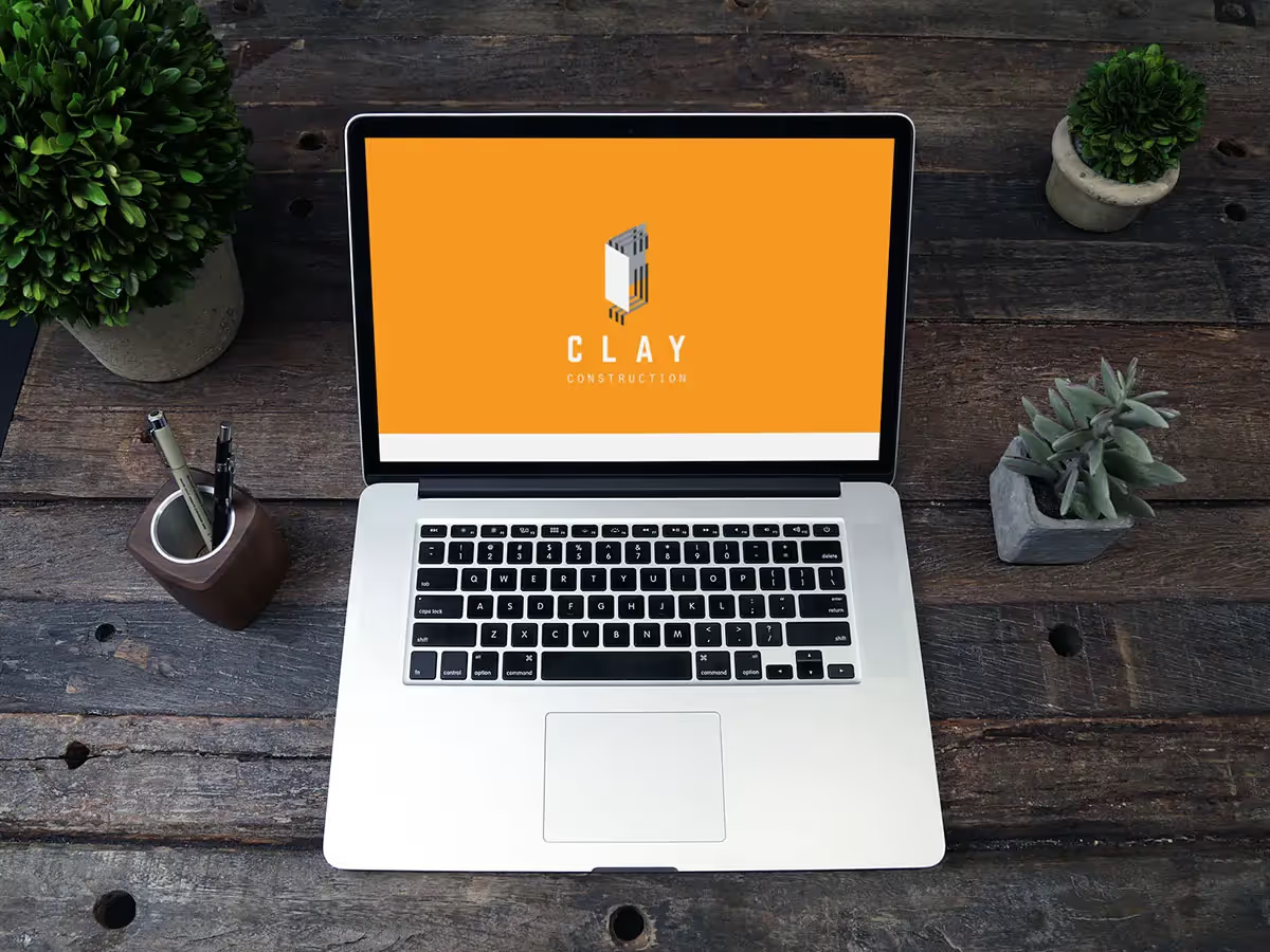
Clay Construction successfully revamped its brand identity with a new logo that creatively integrates elements of drywall and metal tubing into a geometric "C." Since the launch, the company has seen increased brand recognition, improved client perceptions of professionalism, and a notable rise in inquiries from both residential and commercial clients.
Design Concept
The logo design concept centered around creating a geometric composite that cleverly incorporated elements of drywall and metal tubing to form the letter "C". This approach was chosen to visually represent the company's name while showcasing the materials and precision involved in their construction work.
Design Process
- Research: We conducted thorough research on the construction industry, focusing on both residential and commercial sectors in Minneapolis.
- Sketching: Multiple initial sketches were created to explore various ways of integrating drywall and metal tubing into a "C" shape.
- Digital Rendering: The most promising concepts were digitally rendered, refining the geometric shapes and proportions.
- Color Selection: A color palette was chosen to reflect durability, professionalism, and approachability.
- Typography: A clean, modern font was selected to complement the geometric logo design.
Final Logo Design
The final logo features a stylized "C" composed of intersecting geometric shapes that represent drywall panels and metal tubing. The design achieves a perfect balance between abstract representation and literal interpretation of construction materials.
Brand Identity Extension
Building on the logo design, we developed a comprehensive brand identity that included:
- A versatile color palette suitable for various applications
- Typography guidelines for consistent communication
- Business card and stationery designs
- Vehicle wrap concepts for company trucks
- Website design elements that incorporate the new visual identity
Results
Since the implementation of the new logo and brand identity, Clay Construction has reported:
- Increased brand recognition in the Minneapolis area
- Improved perception of professionalism among clients
- A 20% increase in inquiries from both residential and commercial sectors
- Positive feedback from employees, who feel a stronger connection to the brand
Conclusion
The creation of Clay Construction's logo and brand identity successfully merged the company's core services with a visually striking design. By incorporating elements of drywall and metal tubing into a geometric "C", we created a unique and memorable brand that resonates with their target audience and sets them apart in the competitive construction industry.
Design Concept
The logo design concept for Clay Construction centered around creating a geometric composite that visually incorporates elements of drywall and metal tubing to form the letter "C." This approach visually represents the company's name while showcasing the materials and precision involved in their construction work.
Design Process
- Research – We researched the construction industry in Minneapolis, focusing on both residential and commercial segments.
- Sketching – Multiple sketches explored different ways of integrating drywall and metal tubing into a recognizable "C" form.
- Digital rendering – The strongest concepts were refined digitally, fine-tuning geometry and proportions.
- Color selection – A palette was chosen to communicate durability, professionalism, and approachability.
- Typography – A clean, modern font was selected to complement the geometric symbol.
Final Logo Design
The final logo features a stylized "C" built from intersecting geometric shapes that reference drywall panels and metal tubing. The mark balances abstraction with literal cues from construction materials, creating a memorable and flexible identity.
Brand Identity Extension
Building on the logo, we developed a broader identity system that includes:
- A versatile color palette for print, digital, and environmental use.
- Typography guidelines for consistent communication.
- Business card and stationery designs.
- Vehicle wrap concepts for the company fleet.
- Website design elements that carry the new visual language online.
Results
Since launching the new brand, Clay Construction has reported:
- Increased brand recognition in the Minneapolis area.
- Improved client perception of professionalism.
- A notable increase in inquiries from both residential and commercial clients.
- Positive internal feedback, with team members feeling a stronger connection to the brand.
Conclusion
The Clay Construction logo and identity successfully merge the company’s core services with a distinctive visual idea. By embedding drywall and metal tubing motifs into a geometric "C," the brand stands out in a crowded market while staying true to the craft and materials of construction.


