My step by step logo design process

1. Filing Out A Creative Brief
It’s nothing too rigid or formal, but I always ask the client to describe their vision for their brand and how they differentiate themselves from their competitors. I ask their budget and ask for examples of graphic design styles they like.
2. Making A Mood Board
Thanks to modern technology I find it very easy to create a broad sample of what I’m going for. This is something I do as early in the process as possible, often even before receiving a deposit because it’s so reliant on capturing the moment.
Use Pinterest: Pinterest isn’t just for trendy recipes and nail artwork, it’s jam packed with curated collections filtered for easy digestion. So! more than the oft-used Google images many graphic designers will do to source basic inspiration, I content that Pinterest is doing a lot more of the work for me because the resulting board is a living shareable document I can link to the client minutes before our first phone call.
Go Analog: So I’ve pinned some things, great. Some bottom of the barrel designers would then drag and drop that imagery into Illustrator, hit image trace, clean it up and charge you full price for stolen IP. Yikes! I chose a career in graphic design because I know my drawing ability from years of fine art electives would give me an edge - so it’s time to sketch. However you do it, there is no replacement for hand made concept sketching to get the ideas out of your head, test them and iterate on them quickly and honestly.
3. Exploring Concepts
Now that I have my mood board and sketched out ideas, it’s time to launch Adobe Illustrator. First, I do a 1:1 recreation of the various ideas I’ve gathered. This tends to net me about 9 concepts minimum that will be presented to the client.
It's essential to use that 1st presentation to show your client you've listened. My recommendation is using a tool like Loom to record a voice-over for the PDF detailing the reasoning behind the logo concepts.
4. Making Iterations
I call it Frankensteining. Taking the best bits of the concepts and combining them to create the semi-finals. The icon from this one, the font from that one...that's proven to be the most fruitful method for me to push logos forward.
5. Delivery
When it comes to deliverables, it's all about being thorough. Below is a typical outcome for a logo that combines an icon and text.
What images am I sending to the client?
- default logo in full color with transparent background
- default logo in black with transparent background
- default logo in white with transparent background
- icon only in full color with transparent background
- icon only in black with transparent background
- icon only in white with transparent background
- text only with in full color transparent background
- text only in black with transparent background
- text only in white with transparent background
What file types should I send?
- PNG - the all around favorite because a transparent background is so commonly needed
- JPG - when having a white background is fine and a PNG is less appealing due to size
- PDF - the standard for print when sharpness cannot be sacrificed
- SVG - the new web standard, perfect when a logo doesn't look as sharp as it could
- EPS - the best possible quality, all vector means it scales up or down infinitely
That's 9 versions of the logo in 5 file types for a grand total of 45 files.
Does that seem excessive? It isn't. At the end of the day this isn't even everything. I could throw in a 32x32 pixel favicon. I can add logos made specifically for their social media such as a variation that's recomposed to fit into a circular shape.
How do I crank out all of these files efficiently? With Logo Package Express
Logo Package Express is the Adobe Illustrator extension that automatically generates and exports logo packages with blazing speed. Check out an overview of Logo Package Express 3.0 below;
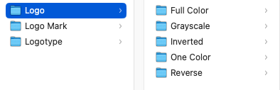
What logo variations does Logo Package Express export?
- CMYK and RGB color gamuts
Logo Components are added using a drag and drop interface
You're not limited to basic logo lockups, you can designate any combination as an export option.
- Logo
- Logotype
- Logo Mark
- Stacked Logo
- Vertical Logo
- Centered Logo
File Types are automatically stored in folders and subfolders
- Adobe Illustrator (.ai)
- Portable Document Format (.pdf)
- Encapsulated PostScript (.eps)
- Scalable Vector Graphics (.svg)
- Portable Network Graphic (.png)
- Joint Photographic Experts Group (.jpg)
Delivery is not the end!
Whether it's a full blown branding guide brochure, a simple one-page style guide or a basic file usage guide it's important to inform the client of what you've just given them, when to use what version and why. While it's tough to police your clients, I do recommend follow their brand on social media, visiting their website and becoming a customer if possible just to monitor their usage so you know they're not using the wrong files - degrading all the hard work you've done. It's also the best way to spot a need that wasn't filled and upsell them on more branding elements.