Chicago's Next
Chicago's Next, a youth mentorship initiative, successfully developed a bold brand identity and responsive website that attract mentors and mentees while clearly outlining program details and application processes. As a result, the program has enhanced its visibility and appeal, establishing itself as a serious yet welcoming initiative supported by partners and funders.
Project Objectives
- Create a compelling brand identity that reflects the program's mission and values
- Develop a user-friendly website to showcase the program and attract mentors and participants
- Establish a cohesive visual language across all brand touchpoints
Brand Identity Development
The brand identity process began with extensive research into youth mentorship programs and Chicago's community landscape. We aimed to create a visual identity that would resonate with both potential mentors and young participants.
Logo Design
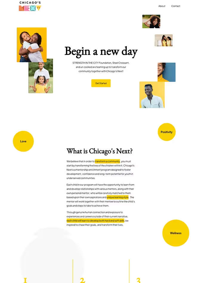
The logo features a stylized "NEXT", incorporating elements that symbolize growth, connection, and stability. The design uses a vibrant color palette to appeal to youth while maintaining a professional appearance for adult stakeholders.
Color Palette and Typography
We selected a color scheme that balances energetic tones with more subdued hues, reflecting the program's focus on youth development and professional guidance. The typography combines a bold sans-serif font for headings with a readable serif for body text, enhancing legibility and visual appeal.
Website Development
The website was designed to serve as an informational hub and a platform for mentor-mentee connections. Key features include:
- Responsive design for seamless viewing on all devices
- Clear program information and benefits for both mentors and mentees
- Easy-to-use application forms for potential mentors and program participants
- Testimonials and success stories to showcase program impact
- Integration with social media platforms to increase engagement
Content Strategy
We developed content that clearly communicates the program's goals, structure, and impact. This included:
- Concise program overviews for quick understanding
- Detailed information on mentor commitments and qualifications
- Engaging descriptions of skill areas participants can develop
- Profiles of team members and partner organizations
Launch and Results
The brand identity and website were successfully launched, resulting in:
- Increased visibility and recognition of Chicago's Next in the community
- A significant uptick in mentor applications and program inquiries
- Positive feedback from partner organizations on the professional presentation
- Enhanced ability to communicate program impact to potential funders and supporters
Conclusion
The creation of a strong brand identity and user-friendly website for Chicago's Next has provided a solid foundation for the program's growth and impact. By effectively communicating its mission and values, Chicago's Next is better positioned to attract mentors, engage youth, and make a lasting difference in the community.
Project Objectives
Chicago’s Next is a youth mentorship initiative from STRENGTH IN THE CITY Foundation, SRV Foundation, and un·cooked.
The identity and site needed to:
- Reflect a program that’s both youth‑driven and grounded in experienced mentors.
- Attract mentors and mentees.
- Make it easy to understand what the program is and how to get involved.
Brand Identity
- A bold, typographic logo treatment for “NEXT” that suggests motion and forward progress.
- A color palette that feels optimistic and energetic without skewing too juvenile.
- Type choices that stay legible while feeling contemporary.
Website
The site serves as the central hub for:
- Program overview and benefits.
- Expectations and commitments for mentors.
- Application flows for both mentors and mentees.
- Stories and outcomes that show real impact.
Key choices:
- Responsive layouts so content is easy to read on phones (where many young participants will see it first).
- Simple forms and clear calls‑to‑action.
- Integration with the larger STRENGTH ecosystem for consistency.
Results
The new identity and site help Chicago’s Next:
- Show up as a serious, well‑run program that still feels welcoming and fun.
- Increase visibility and application interest.
- Give partners and funders a professional face they can confidently support.
Related Projects
View projects within the same niches.