We Love To Uplift

The case study for "We Love To Uplift" highlights the logo redesign process that aimed to convey trust and authority while ensuring continuity for existing supporters. The final logo evolved from the original design and is adaptable for use across various applications, including print and digital materials.
Disciplines
Visual Identity Graphic Design
Industry
Non-profit


We Love To Uplift is a Chicago‑area nonprofit focused on supporting people facing social, emotional, or health challenges.
The logo work emphasized:
- Trust and authority, which are critical in nonprofit contexts.
- A clear evolution from the original mark so existing supporters still recognize the organization.
- A system that can extend into style‑guide‑driven applications like print, web, and event collateral.
Case‑study visuals show the original logo, exploration, and the final refined system.
Related Projects
View projects within the same niches.
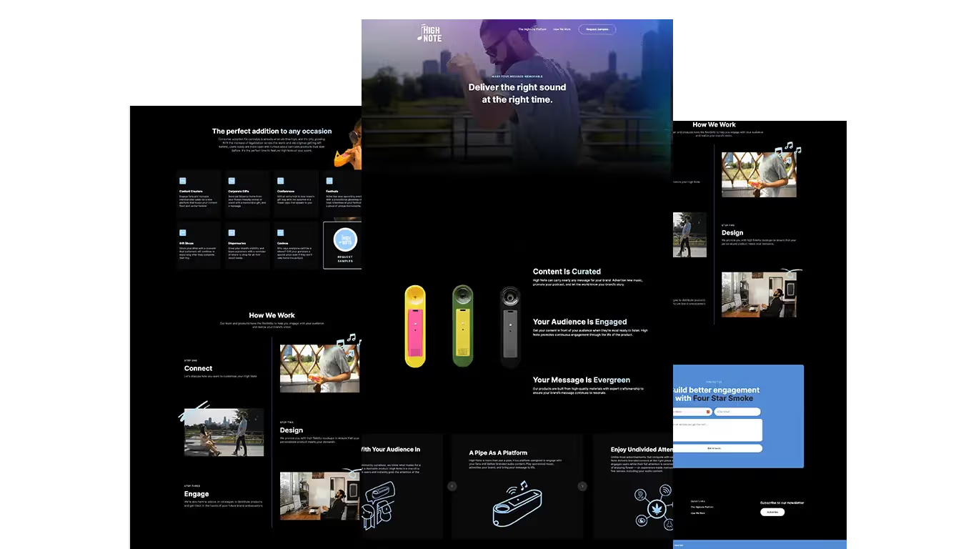
High Note
Logo and Website
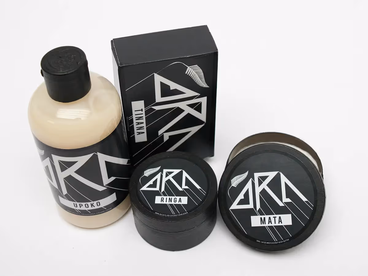
Ora Cosmetics
Logo and Packaging

Zubels
Website and Amazon EBC