Atmos

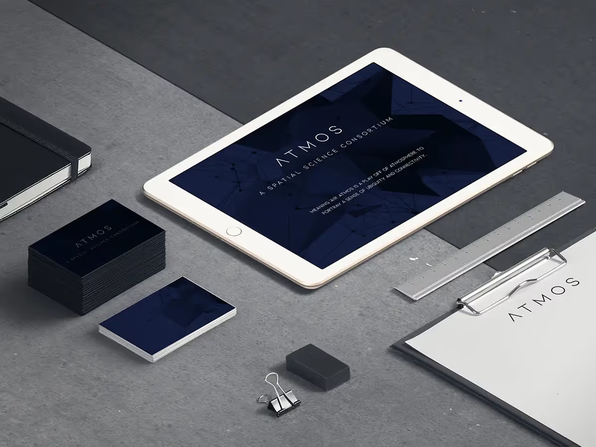
The Atmos project involved creating a visual identity for a spatial science consortium that bridges physical space and advanced computation. The identity integrates a modern sans serif logo, a deep color palette, and a flexible graphic language to communicate the consortium's focus on connectivity and intelligence in the built environment.
ATMOS, in partnership with Scanalytics Inc. and Salt Flats Innovation House, is dedicated to understanding and applying research on the built environment and its interactions with businesses, customers, and occupants. The consortium leverages Big Data, Artificial Intelligence (AI), machine learning, the Internet of Things (IoT), and other disruptive technologies to enhance user experience in physical spaces. While virtual organizations can easily gather data from digital platforms, those in the physical space often rely on intuition and experience. ATMOS bridges this gap by integrating spatial technologies with entrepreneurship, design thinking, and life sciences, resulting in a comprehensive, data-driven understanding of physical environments—a concept they term Spatial Intelligence (SI).
Design and Development Process
The design process for the ATMOS logo began with understanding the core values and mission of the consortium. The logo needed to convey innovation, sophistication, and a strong connection to spatial intelligence. To achieve this, we opted for a sleek and minimalist design using the Ailerons font, known for its modern and clean look.
Conceptualization
We started with several brainstorming sessions to gather ideas and inspirations. The focus was on creating a logo that would be timeless and versatile, suitable for both digital and physical applications. The spacious lettering in Ailerons provided the perfect balance between modernity and readability.
Iteration and Feedback
Multiple iterations of the logo were created, each refining the design to better align with ATMOS's brand identity. Feedback from stakeholders was integral during this phase, ensuring the final design met all expectations.
Final Design
The final logo design features the word "ATMOS" in Ailerons font, characterized by its sleek lines and spacious lettering. The minimalist approach ensures the logo is easily recognizable and adaptable across various mediums and sizes. The clean design also aligns with the data-driven and innovative essence of ATMOS, making it a fitting representation of the consortium's mission and values.
Conclusion
The creation of the ATMOS logo was a collaborative and iterative process aimed at encapsulating the consortium's dedication to advancing spatial intelligence through cutting-edge technologies. The final design successfully reflects the innovative and sophisticated nature of ATMOS, providing a strong visual identity that supports their mission in revolutionizing the understanding of physical environments.
Atmos: Visualizing a Networked Future for Spatial Science
Atmos is a spatial science consortium whose work lives at the intersection of physical space and advanced computation. Their teams use AI, IoT, and massive spatial datasets to understand and orchestrate the built environment, connecting physical and social worlds in ways that feel almost invisible to the end user.
The name “Atmos” is a deliberate play on “atmosphere” and “air” — something that is everywhere and nowhere at once. Our design challenge was to translate that sense of ubiquity, connectivity, and intelligence into a visual identity for their Chicago hub in the River West / Fulton Market area.
Strategy: Ubiquity, Connectivity, and the Built World
From the outset, the brand needed to reconcile a few tensions:
- Physical vs. digital
Atmos operates on real buildings and cities, but their leverage comes from data, models, and computation.
- Scientific rigor vs. approachability
It is a consortium of specialists, yet it must be clear and legible to partners, civic groups, and commercial clients.
- Networked and ubiquitous, not loud
The brand should feel present everywhere in the system without overwhelming the environments it lives in.
We framed the identity around three core ideas:
- Ubiquitous presence – Atmos as a kind of invisible infrastructure, always on and always aware.
- Interconnected intelligence – A network of companies and disciplines sharing spatial data and insight.
- Spatial clarity – A visual language rooted in architecture and urban grids, not sci‑fi tropes.
These principles guided every choice from typography and color to supporting graphics.
Typography: A Custom Sans Built on Avenir
Atmos needed a typographic voice that felt contemporary, precise, and human. Avenir provided a strong foundation: a geometric sans serif with enough warmth to avoid the coldness often associated with “tech” branding.
We created a custom sans serif based on Avenir, refining and extending it to better fit Atmos’ story:
- Geometry tuned for legibility
We preserved Avenir’s clean geometric structure but adjusted proportions and spacing for clarity at both architectural scale (signage) and interface scale (dashboards and tools).
- Subtle custom moments
Letterforms like the “A”, “M”, and “S” were given slight, distinctive cuts and angles that echo the idea of intersecting planes and spatial axes — a nod to mapping, floorplans, and 3D schematics.
- Neutral but characterful
The final logotype feels grounded and professional, with enough personality to stand apart without resorting to heavy ornamentation.
The wordmark “ATMOS” becomes a confident anchor in a system that leaves room for rich data-driven visuals around it.
Color: Dark Navy, Black, and the Depth of Data
Atmos works with massive, layered datasets. We chose a dark navy and black palette to reflect that depth while staying timeless and flexible.
- Dark navy acts as the primary brand color, associated with intelligence, stability, and the night-sky metaphor of networks and constellations.
- Black creates strong contrast for the logotype and key applications, giving the brand a serious, research-grade presence.
- Tints and subtle gradients can be introduced in digital contexts to suggest dimensionality and layers of information without overwhelming the core palette.
This restrained color system ensures that when data visualizations, maps, and spatial interfaces come into play, they can carry color and motion without clashing with the brand.
Visual Language: Abstract Forms and Interconnected Lines
Beyond the logotype, we developed a graphic system built from abstract shapes and interconnecting lines. This toolkit gives Atmos a way to visualize connectivity and spatial relationships across applications.
Key components:
- Nodes and connectors
Points, lines, and arcs represent sensors, data streams, and relationships between spaces and people.
- Layered fields
Overlapping geometric shapes echo building footprints, parcels, and zoned areas.
- Directionality and flow
Line systems bend, branch, and reconverge, mirroring how Atmos ingests data from many sources and outputs clear, actionable insight.
Visually, the system feels like a quiet, intelligent network: always present, always connected, but never chaotic.
Context: Rooted in Chicago’s River West / Fulton Market
The first Atmos identity deployment was for their Chicago location in the River West / Fulton Market district — an area known for its evolution from industrial corridor to innovation hub.
We drew inspiration from this context in a few subtle ways:
- Grid and infrastructure
Chicago’s strong urban grid and history of infrastructure engineering influenced the structured, modular layouts used in print and digital.
- Industrial to digital
The interplay of dark materials, concrete, steel, and glass in the neighborhood is echoed in the dark palette and clean geometry of the mark.
- Local but scalable
While the Chicago office was the initial focus, the identity is designed to scale to other locations and partner organizations within the consortium.
Applications: From Building Scale to Interface
The Atmos mark and visual system were designed with multiple layers of use in mind, from the physical to the fully digital:
- Environmental branding
Exterior signage and interior wayfinding can carry the logotype in its purest form, with line systems appearing as subtle wall graphics, frosted glass patterns, or floor overlays.
- Print and presentations
Reports, board decks, and research summaries use the graphic language to bring structure and hierarchy to complex spatial data.
- Digital tools and dashboards
Within interfaces, the identity recedes just enough to prioritize data, but type, color, and connection motifs keep the experience distinctly Atmos.
Across all of these, the goal is the same: help people understand and trust the invisible intelligence shaping the spaces around them.
Outcome
The Atmos logo and visual system encapsulate a consortium that:
- Works in the physical built environment, yet thinks in data and models.
- Connects AI, IoT, and advanced computing across scientific disciplines.
- Links physical and social worlds into smarter, more responsive spaces.
By anchoring the brand in a custom, modern sans serif, a deep and disciplined color system, and a flexible language of abstract forms and lines, we created an identity that can live quietly inside buildings, reports, and tools while still conveying the scale and ambition of Atmos’ vision.


