Chip Kick

Chip Kick successfully developed a strong brand identity and a user-friendly website that effectively showcases their services in electronic product development. The cohesive visual elements and engaging content have significantly enhanced their professional image and increased client inquiries.
Brand Identity Development
The first phase of the project focused on creating a strong, memorable brand identity for Chip Kick. Our design team began by conducting extensive research into the electronic product development industry and Chip Kick's unique position within it.
Logo Design: The logo was designed to symbolize Chip Kick's technical prowess and innovation. We created a stylized "CK" monogram that resembles a circuit board pattern, emphasizing the company's core focus. The logo uses bold, angular lines to convey precision and technological advancement.
Color Palette: We chose a primary color palette of deep blue and electric green. The blue represents trust and professionalism, while the green signifies innovation and growth. This combination effectively communicates Chip Kick's blend of reliability and cutting-edge technology.
Typography: A modern, sans-serif typeface was selected for its clean lines and readability, reflecting the precision required in electronic product development.
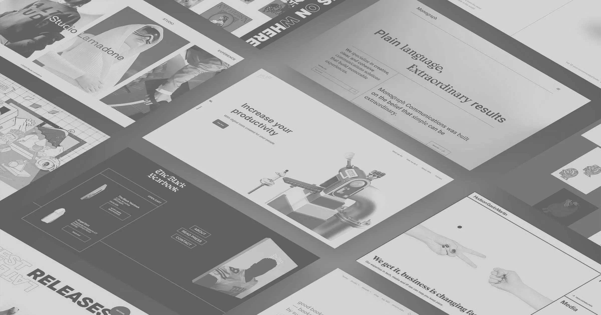
Website Development
With the brand identity established, we moved on to designing and developing a website that would effectively showcase Chip Kick's services and expertise.
Design Phase: The website design incorporated the new brand elements, creating a cohesive visual experience. We focused on a clean, minimalist layout that allows the technical content to shine. Interactive elements were added to engage visitors and demonstrate Chip Kick's technological capabilities.
Development Phase: The website was built using a responsive framework to ensure optimal viewing across all devices. We integrated a user-friendly content management system, allowing Chip Kick to easily update their service offerings and showcase new projects.
Content Integration: We worked closely with Chip Kick to develop clear, concise content that effectively communicates their services. Each major service area - System Architecture, Circuit Simulations, PCB Layouts, etc. - was given its own dedicated page with detailed information and relevant case studies.
Results and Impact
The new brand identity and website have significantly enhanced Chip Kick's professional image and online presence. The cohesive visual language across all touchpoints has strengthened brand recognition, while the informative and user-friendly website has led to increased engagement and inquiries from potential clients. Chip Kick now has a digital platform that truly reflects their position as a leader in electronic product development.
Brand Identity Development
The first phase of the project focused on creating a strong, memorable brand identity for Chip Kick. Our design team began by conducting extensive research into the electronic product development industry and Chip Kick's unique position within it.
Logo Design
The logo was designed to symbolize Chip Kick's technical prowess and innovation. We created a stylized "CK" monogram that resembles a circuit board pattern, emphasizing the company's core focus. The logo uses bold, angular lines to convey precision and technological advancement.
Color Palette
We chose a primary color palette of deep blue and electric green. The blue represents trust and professionalism, while the green signifies innovation and growth. This combination effectively communicates Chip Kick's blend of reliability and cutting-edge technology.
Typography
A modern, sans-serif typeface was selected for its clean lines and readability, reflecting the precision required in electronic product development.
Website Development
With the brand identity established, we moved on to designing and developing a website that would effectively showcase Chip Kick's services and expertise.
Design Phase
The website design incorporated the new brand elements, creating a cohesive visual experience. We focused on a clean, minimalist layout that allows the technical content to shine. Interactive elements were added to engage visitors and demonstrate Chip Kick's technological capabilities.
Development Phase
The website was built using a responsive framework to ensure optimal viewing across all devices. We integrated a user-friendly content management system, allowing Chip Kick to easily update their service offerings and showcase new projects.
Content Integration
We worked closely with Chip Kick to develop clear, concise content that effectively communicates their services. Each major service area—system architecture, circuit simulations, PCB layouts, and more—was given its own dedicated page with detailed information and relevant case studies.
Results and Impact
The new brand identity and website have significantly enhanced Chip Kick's professional image and online presence. The cohesive visual language across all touchpoints has strengthened brand recognition, while the informative and user-friendly website has led to increased engagement and inquiries from potential clients. Chip Kick now has a digital platform that truly reflects their position as a leader in electronic product development.
Related Projects
View projects within the same niches.