Author Clock
The Author Clock project successfully merged literature and timekeeping by developing a minimalist logo and visual identity that appeals to book lovers and gadget enthusiasts. Its distinctive design has positioned the product as a premium item in the MoMA store, enhancing brand recognition and making it a popular gift choice.
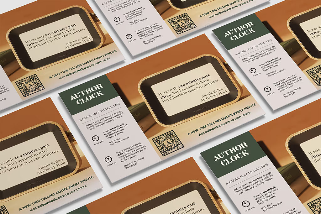
Author Clock, a unique timepiece that displays literary quotes corresponding to the current time, required a logo that would reflect its innovative concept and appeal to book lovers and gadget enthusiasts alike. This case study explores the creative process behind developing a visual identity for this popular product, now sold at the prestigious MoMA.
Project Overview
Author Clock is a product that combines literature and timekeeping, featuring over 13,000 quotes that correspond to different times of the day. The challenge was to create a logo and visual identity that would capture the essence of this literary timepiece while appealing to its target market of book lovers and gadget enthusiasts.
Design Objectives
- Create a minimalist logo inspired by Author Clock's celebration of literature
- Develop a custom font that reflects the product's unique character
- Establish a visual identity built around natural materials and earth tones
- Design a tactile palette that resonates with the physical nature of books and clocks
The Design Process
1. Research and Conceptualization: The design team began by immersing themselves in the world of literature and clock design. They studied classic book typography, analyzed various clock faces, and explored the intersection of these two elements.
2. Custom Font Development: A bespoke font was created to serve as the cornerstone of the logo. This font was designed to be minimalist yet evocative of literary traditions. The letterforms were crafted to subtly hint at clock hands, merging the concepts of time and text.
3. Color Palette Selection: Inspired by the tactile nature of books and the warmth of wooden clocks, a palette of earth tones was chosen. This included rich browns, warm tans, and soft creams, reminiscent of aged paper and well-loved book covers.
4. Logo Design: The logo itself was crafted using the custom font, with the words "Author Clock" arranged in a circular formation, mimicking a clock face. The negative space within the arrangement subtly suggested clock hands, reinforcing the product's function.
5. Visual Identity Extension: The team expanded the logo concept into a comprehensive visual identity. This included patterns inspired by book pages, textures reminiscent of book bindings, and graphic elements that echoed the circular motif of the logo.
Implementation and Results
The final logo and visual identity were applied across various touchpoints:
- Product Packaging: The packaging was designed to feel like opening a cherished book, with the logo embossed on a textured surface.
- Website and Digital Presence: The website incorporated the earth-tone palette and featured the logo prominently, with animations that brought the clock concept to life.
- Marketing Materials: Brochures and advertisements were designed to resemble book pages, with the logo serving as a distinctive mark of quality and innovation.
- In-Store Displays: For the MoMA store, a special display was created that showcased the Author Clock alongside classic literature, emphasizing its place at the intersection of art and functionality.
Impact and Reception
The logo and visual identity for Author Clock have been instrumental in its success:
- Brand Recognition: The distinctive logo has become instantly recognizable among literary and design enthusiasts.
- Product Positioning: The visual identity has helped position Author Clock as a premium, design-forward product worthy of its place in the MoMA store.
- Target Market Appeal: The combination of minimalist design and literary inspiration has resonated strongly with both book lovers and gadget enthusiasts.
- Gift Market Success: The thoughtful design has contributed to Author Clock becoming a popular gift item, appealing to those seeking unique and meaningful presents.
Conclusion
The creation of the Author Clock logo and visual identity demonstrates the power of thoughtful design in capturing the essence of a product. By blending minimalist aesthetics with literary inspiration and a focus on natural materials and earth tones, the design team successfully created a visual language that speaks to the product's unique value proposition.
The success of Author Clock in the prestigious MoMA store and its popularity as a gift item for book lovers and gadget enthusiasts alike is a testament to the effectiveness of the design strategy. The logo and visual identity not only represent the product but also tell a story, inviting customers to experience the joy of literature and timekeeping in a whole new way.
Author Clock, a unique timepiece that displays literary quotes corresponding to the current time, required a logo that would reflect its innovative concept and appeal to book lovers and gadget enthusiasts alike.
Project Overview
Author Clock is a product that combines literature and timekeeping, featuring over 13,000 quotes that correspond to different times of the day. The challenge was to create a logo and visual identity that would capture the essence of this literary timepiece while appealing to its target market of book lovers and gadget enthusiasts.
Design Objectives
- Create a minimalist logo inspired by Author Clock's celebration of literature.
- Develop a custom font that reflects the product's unique character.
- Establish a visual identity built around natural materials and earth tones.
- Design a tactile palette that resonates with the physical nature of books and clocks.
The Design Process
1. Research and conceptualization
The design team began by immersing in the world of literature and clock design. They studied classic book typography, analyzed various clock faces, and explored the intersection of these two elements.
2. Custom font development
A bespoke font was created to serve as the cornerstone of the logo. This font was designed to be minimalist yet evocative of literary traditions. The letterforms were crafted to subtly hint at clock hands, merging the concepts of time and text.
3. Color palette selection
Inspired by the tactile nature of books and the warmth of wooden clocks, a palette of earth tones was chosen: rich browns, warm tans, and soft creams reminiscent of aged paper and well-loved book covers.
4. Logo design
The logo itself was crafted using the custom font, with the words "Author Clock" arranged in a circular formation, mimicking a clock face. Negative space subtly suggested clock hands, reinforcing the product's function.
5. Visual identity extension
The logo concept extended into a comprehensive visual identity system, including:
- Patterns inspired by book pages.
- Textures reminiscent of book bindings.
- Graphic elements echoing the circular motif of the logo.
Implementation and Results
The final logo and visual identity were applied across multiple touchpoints:
- Product packaging – Designed to feel like opening a cherished book, with the logo embossed on a textured surface.
- Website and digital presence – The website incorporated the earth-tone palette and featured the logo prominently, with subtle animations that brought the clock concept to life.
- Marketing materials – Brochures and ads were designed to resemble book pages, with the logo as a clear, consistent mark.
- In-store displays (MoMA) – A special display showcased Author Clock alongside classic literature, emphasizing its place at the intersection of art and functionality.
Impact and Reception
The logo and visual identity for Author Clock have been instrumental in its success:
- Brand recognition – The distinctive logo has become recognizable among literary and design enthusiasts.
- Premium positioning – The visual identity has helped position Author Clock as a design-forward product worthy of its place in the MoMA store.
- Target market appeal – The combination of minimalist design and literary inspiration resonates strongly with both book lovers and gadget enthusiasts.
- Gift market traction – The thoughtful design contributes to Author Clock’s popularity as a unique, meaningful gift.
Conclusion
The creation of the Author Clock logo and visual identity demonstrates the power of thoughtful design in capturing the essence of a product. By blending minimalist aesthetics with literary inspiration and a focus on natural materials and earth tones, the design team created a visual language that speaks to the product's unique value.
The success of Author Clock in the MoMA store and its popularity as a gift item is a testament to the effectiveness of this design strategy. The logo and visual identity not only represent the product but also tell a story, inviting customers to experience the joy of literature and timekeeping in a new way.
Related Projects
View projects within the same niches.