Strength In The City

The "Strength In The City" logo development effectively captures the essence of a fitness and wellness brand by balancing strength with approachability, making it suitable for both intense workouts and broader wellness initiatives. Its flexible design accommodates various applications, from event promotions to merchandise, ensuring visibility across diverse platforms.
Disciplines
Visual Identity Graphic Design
User Interface Graphic Design
Industry
Fitness
Strength In The City’s logo work supports a fitness and wellness brand built around community events.
The visual identity:
- Balances strength and approachability so it works for both hardcore workouts and broader wellness audiences.
- Includes flexible lockups for events, sub‑brands, and merchandise.
- Is designed to show up well on everything from posters and social graphics to shirts and signage.
Related Projects
View projects within the same niches.
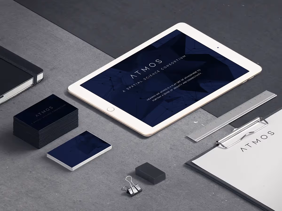
Atmos
Logo and Graphic Design

Siemens
Website

Chicago Strength
Logo and Graphic Design