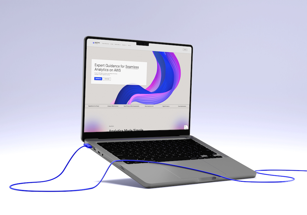
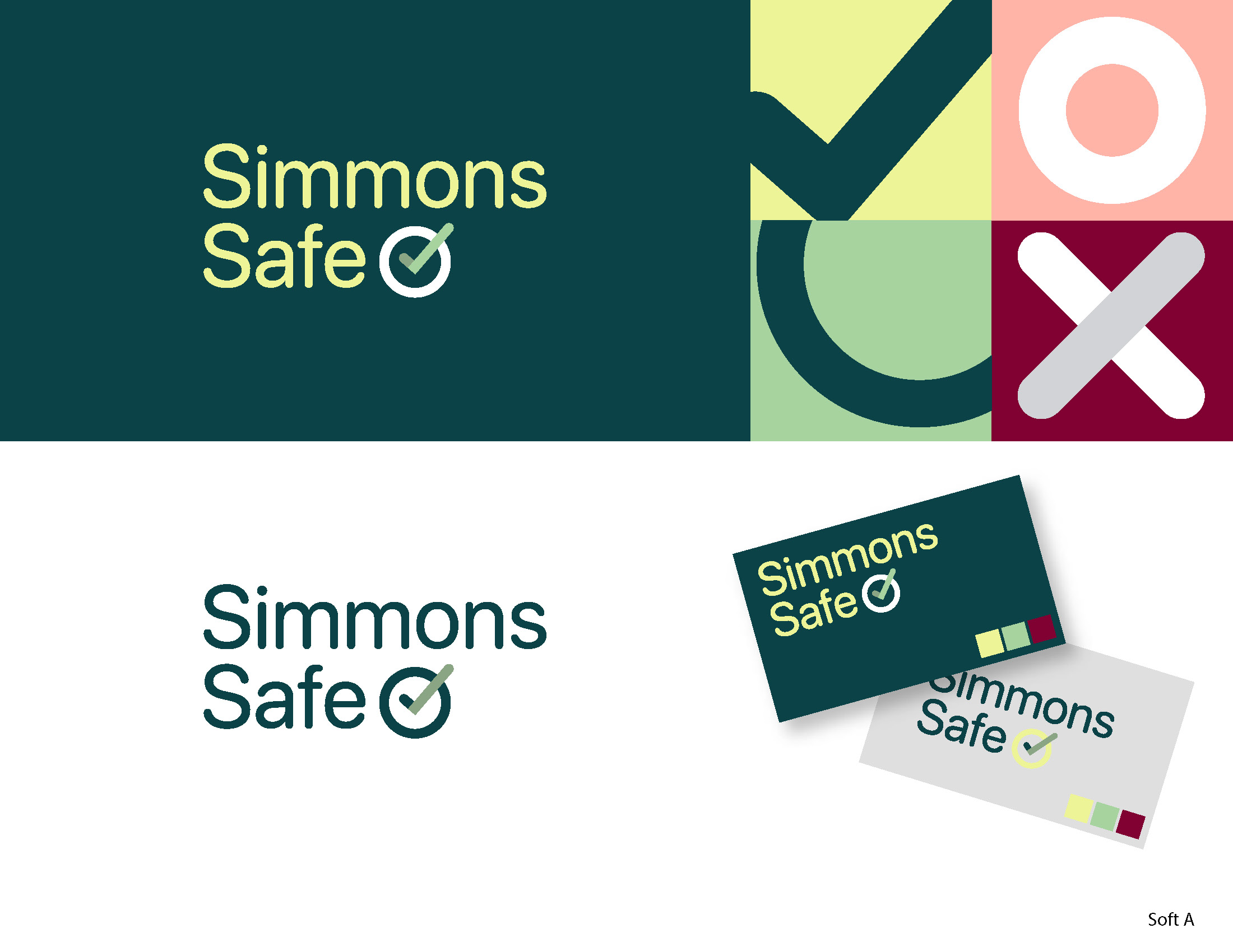
Homade collaborated with Steel Croissant to modernize the Simmons Safe brand, creating a new logo and branding system that reflects its role as a leader in compliance for the healthcare industry. The resulting cohesive brand identity and user-friendly website, simmonssafe.io [http://simmonssafe.io/], effectively communicate the blend of technology and human expertise, positioning compliance as a strategic advantage for clients.

AIWA partnered with our design team to enhance their online presence through visually engaging sale sheets and graphics, resulting in improved brand visibility and increased sales on their Amazon Storefront. The successful collaboration focused on consistent branding and effective product showcasing, leading to a noticeable boost in customer engagement and sales metrics.
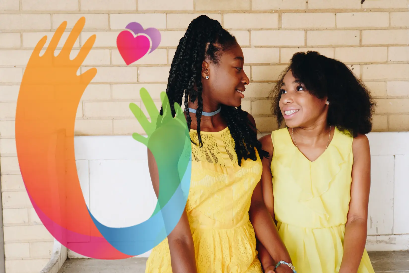
The case study for "We Love To Uplift" highlights the logo redesign process that aimed to convey trust and authority while ensuring continuity for existing supporters. The final logo evolved from the original design and is adaptable for use across various applications, including print and digital materials.
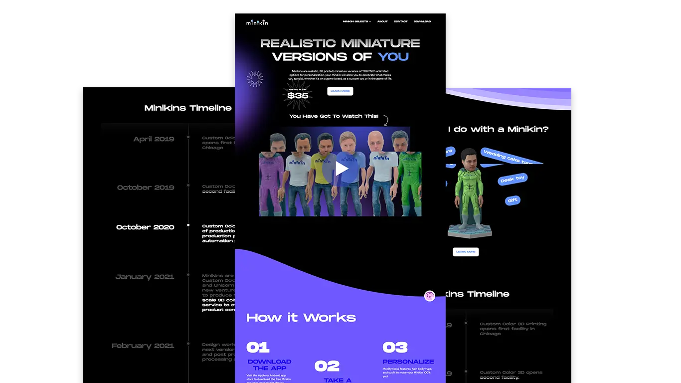
Minikin focused on art direction for a brand positioned at the intersection of retail and technology, emphasizing visual systems that function well in both physical and digital spaces. The project prioritized strong, product-forward imagery with modern layouts and typography that maintain brand distinctiveness while keeping the focus on the products.
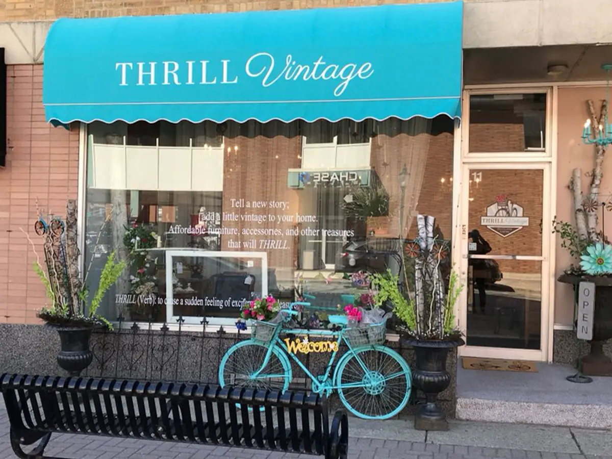
The Thrill Vintage project focused on creating a logo and storefront identity for a furniture and consignment store in Arlington Heights, IL, combining vintage character with modern readability. The process included developing mood boards, iterating logo concepts, and ultimately applying the final design as elegant signage that enhances the store's welcoming atmosphere.
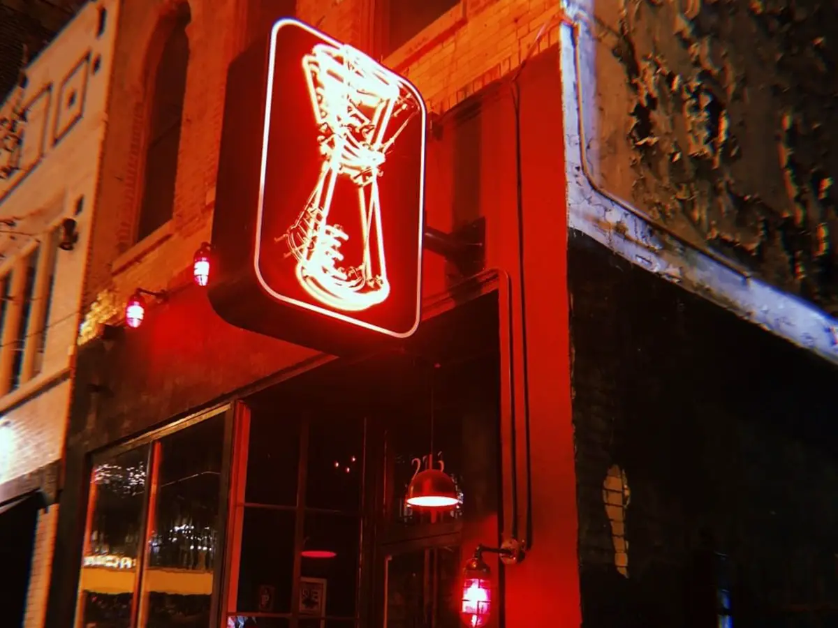
The "Good Measure" project successfully blended a punk rock aesthetic with meticulous cocktail craftsmanship, resulting in a distinctive logo centered around a jigger motif. Through iterative design processes and a cohesive visual language, the brand identity captures the vibrancy and precision of the bar, ensuring consistency across various graphic collateral like matchbooks and drink coasters.
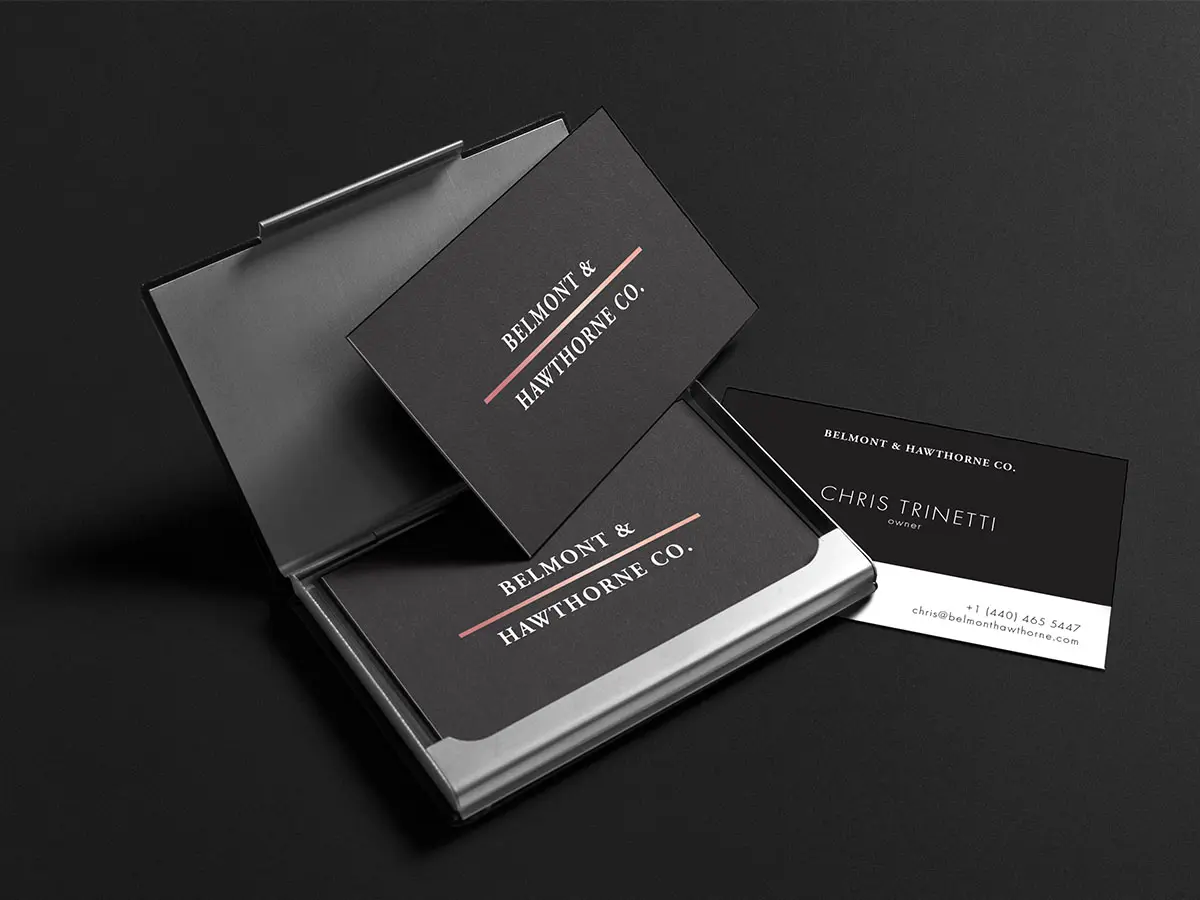
The Belmont & Hawthorne project focuses on creating a cohesive visual identity for a mixed-use urban corner that integrates retail, hospitality, and community life. By treating the area as a shared platform and implementing thoughtful design elements, the project aims to transform the location into a vibrant destination through effective wayfinding and digital presence.
The "Lucke" project, currently active in the field of graphic design, showcases a series of images that highlight its creative direction. Despite its Chicago-based status, the project emphasizes visual engagement through its innovative design elements.