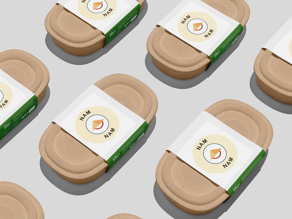
Nam Nam, a Vietnamese spring roll startup, developed a visual identity that highlights authentic cuisine while standing out on shelves and digital platforms. By centering the iconic nón lá in its logo, the brand effectively connects with customers seeking genuine Vietnamese flavors in a competitive market.
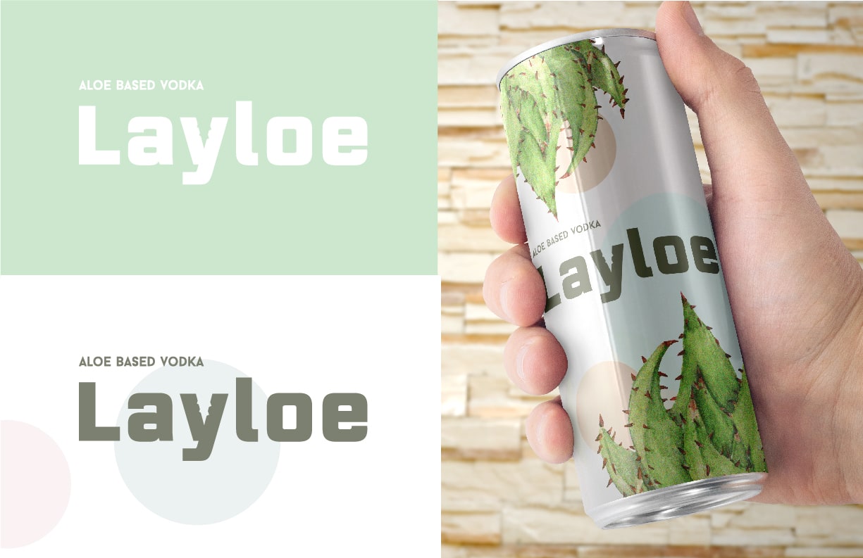
The Layloe project focused on creating a bold, lifestyle-oriented logo and packaging for Steel Croissant, emphasizing standout color and packaging concepts suitable for retail displays. The outcome is a modern and expressive visual system that maintains coherence as the product line expands across various SKUs and collections.
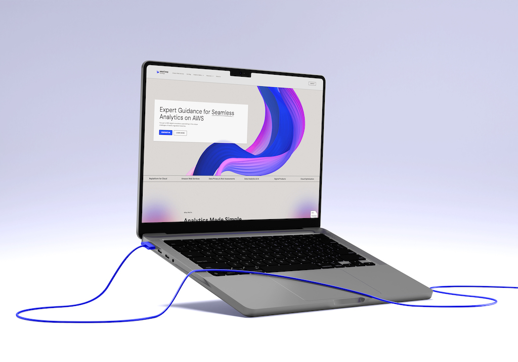
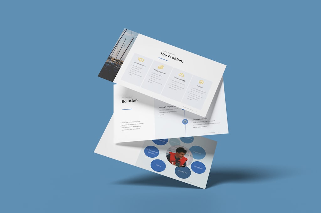
Freight Train Ventures developed an investor-facing presentation deck for Steel Croissant, focusing on clear communication of the fund thesis, structure, and pipeline. The design utilized visual hierarchy to make complex information digestible, ensuring consistent typography, color, and layout throughout the presentation.

Outfits by Adrianna sought to establish a brand identity that combined high-fashion sensibility with a warm, approachable feel for personal styling clients. The resulting design features a sophisticated mark inspired by a woman's leg silhouette, complemented by a palette of rose and warm earth tones, effectively positioning the brand as both premium and inviting.
DockMago sought to enhance its marketing efforts by developing a cohesive PowerPoint template and a concise sell sheet that effectively communicate its value proposition to marinas and potential partners. Through a streamlined design process, these materials now provide a professional and consistent framework for presentations, enabling DockMago to present itself as a reliable partner in the marina operations space.
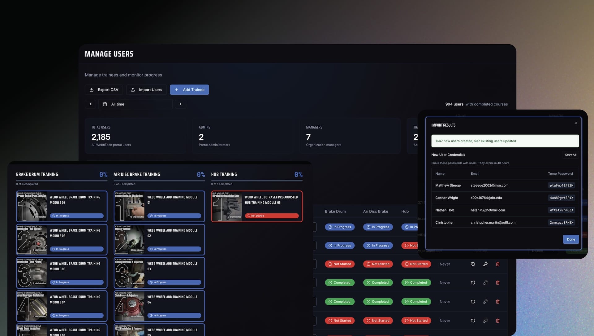
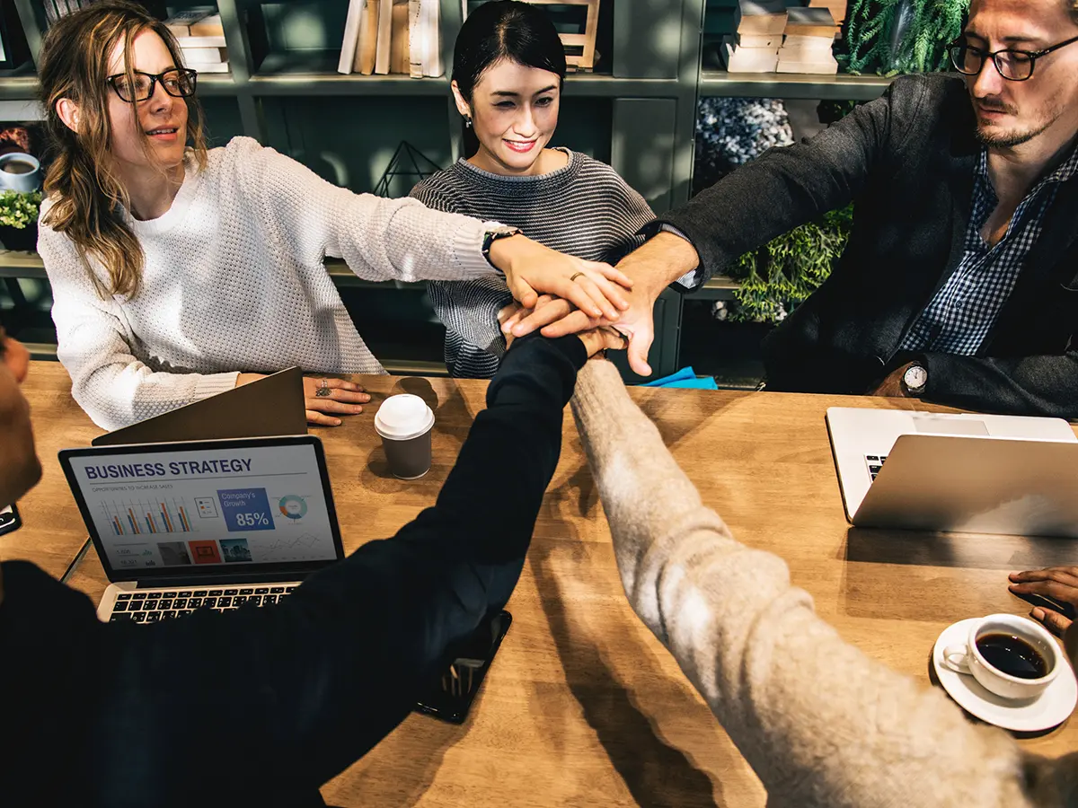
WebbTech partnered with Steel Croissant to develop a custom training platform that consolidated scattered training materials into a mobile-friendly web app, saving $45,000–$60,000 in costs. The new system improved user experience, allowing quick access to training modules and comprehensive progress tracking, ultimately transforming the training process into a streamlined learning experience.
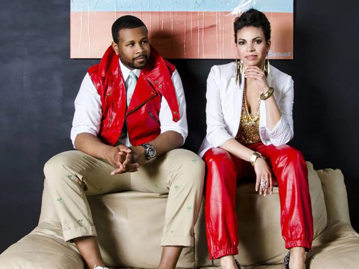
This case study highlights the graphic design collaborations with P.R.S.V.R., focusing on their "Black Wealth Matters" campaign and branding for their children's line. The work encompassed apparel graphics, business collateral, and digital communications, effectively conveying the brand's unique blend of minimalism and grandeur.
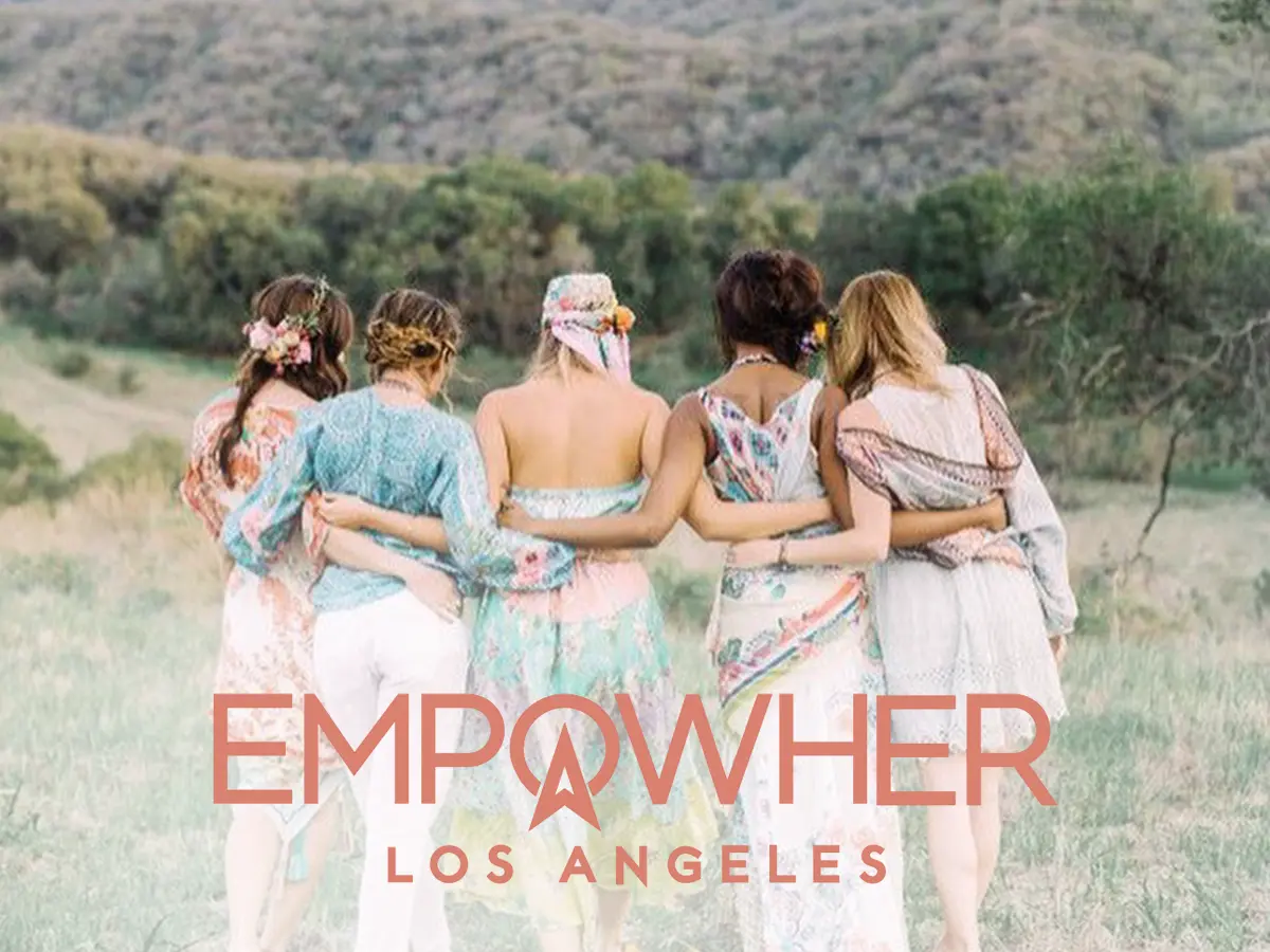
EmpowHER LA is a California-based organization dedicated to empowering women through community-building events and entrepreneurship. The visual identity focuses on emphasizing "HER" in the logo to create a modern, welcoming aesthetic that invites women to embrace their personal agency and connect with a supportive network.

Ora Cosmetics successfully developed a clean and modern logo and packaging design that enhances its presence in the beauty market. The new identity prioritizes clarity and flexibility, ensuring it can adapt to future products while appealing to both direct-to-consumer and retail channels.