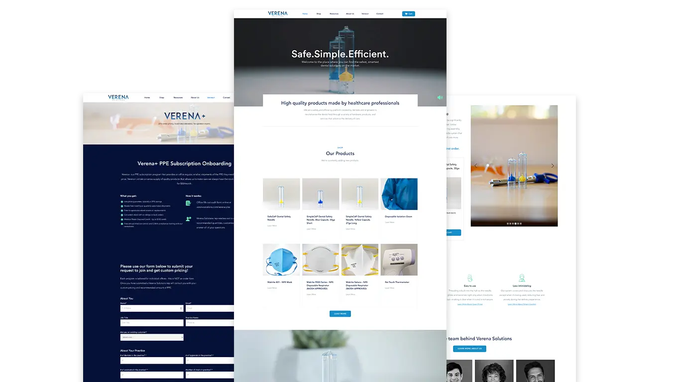
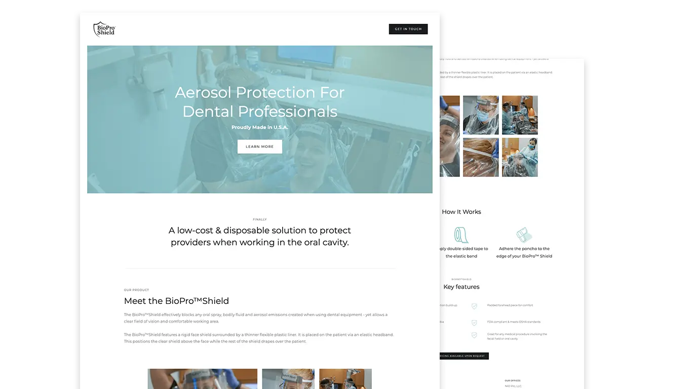
Verena Solutions focused on developing a digital presence for their dental and medical products, emphasizing safety, organization, and efficiency. The project effectively positioned Verena as a thoughtful partner, helping teams understand the relevance of their products in clinical workflows through clear, engaging content.
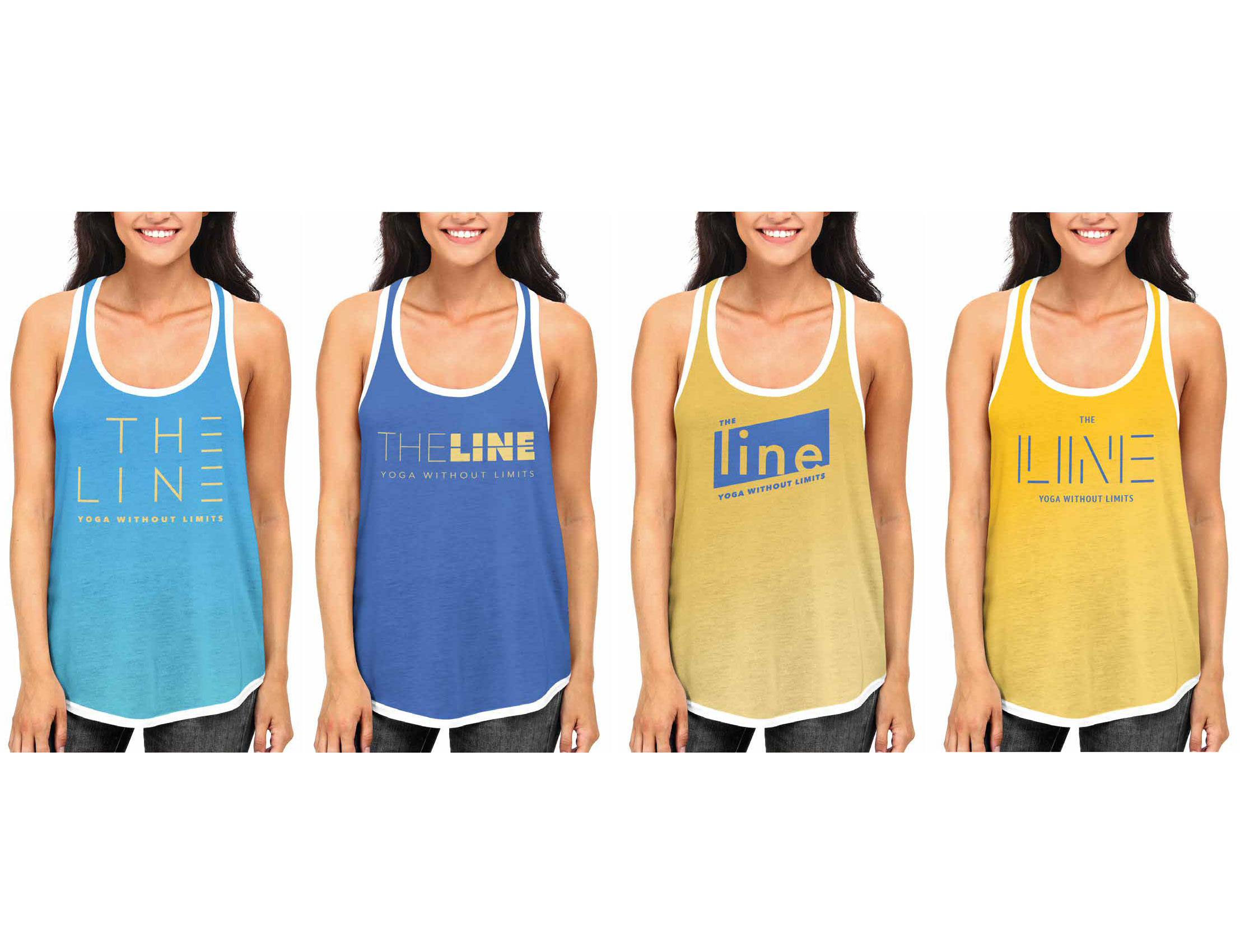
The Line is a fitness brand that emphasizes a strong identity through its logo, which incorporates linear forms to convey focus and progression. This identity has been tested across various merchandise and applications, ensuring it is versatile enough for both performance and lifestyle contexts.
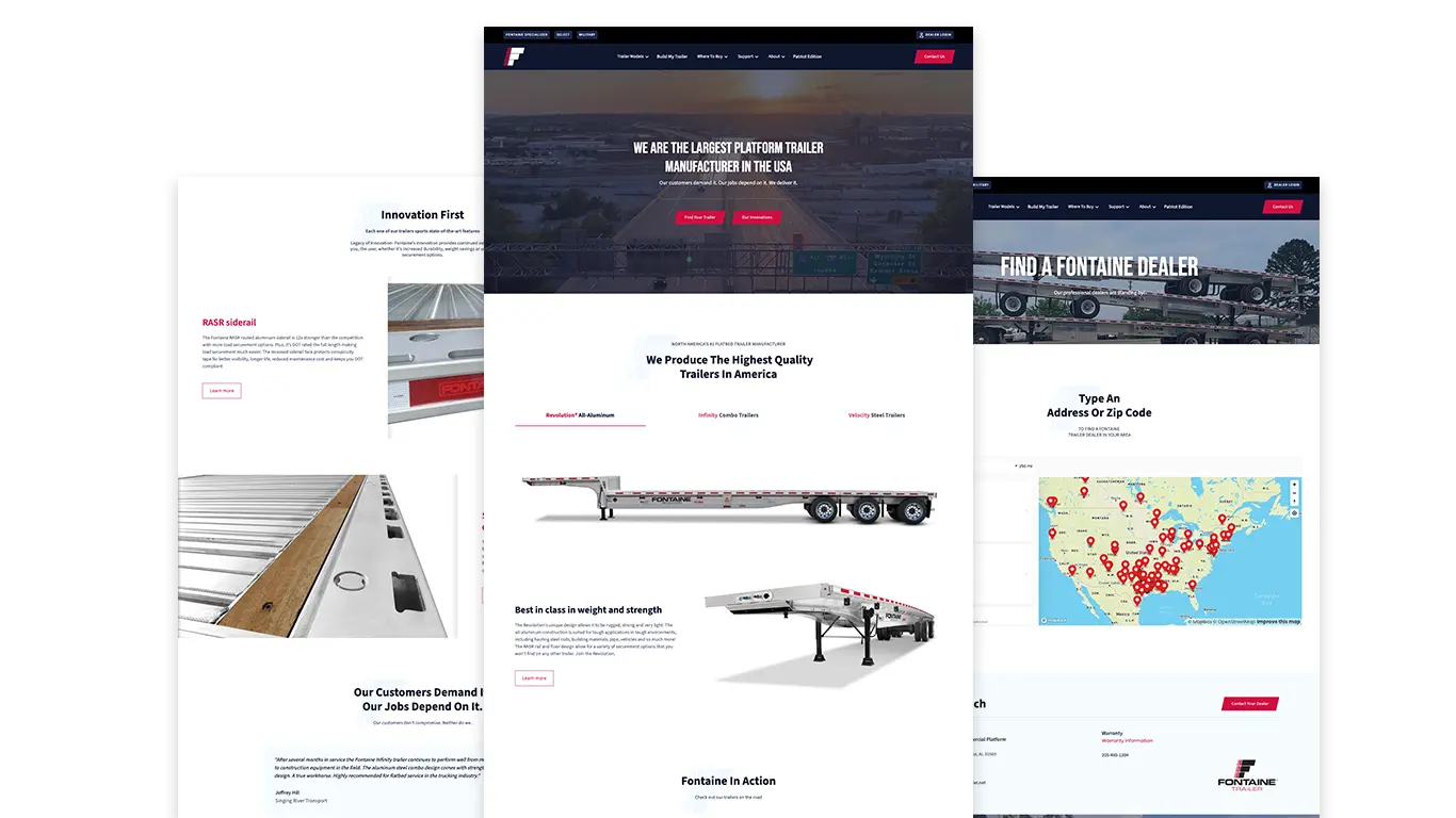
The Fontaine Trailer website redesign successfully showcases the extensive product line while honoring the company's 80-year legacy, offering an intuitive interface for buyers to configure their trailers. Key features, including an advanced product catalog and a real-time "Build My Trailer" configurator, enhance user experience and support sales teams with qualified leads.
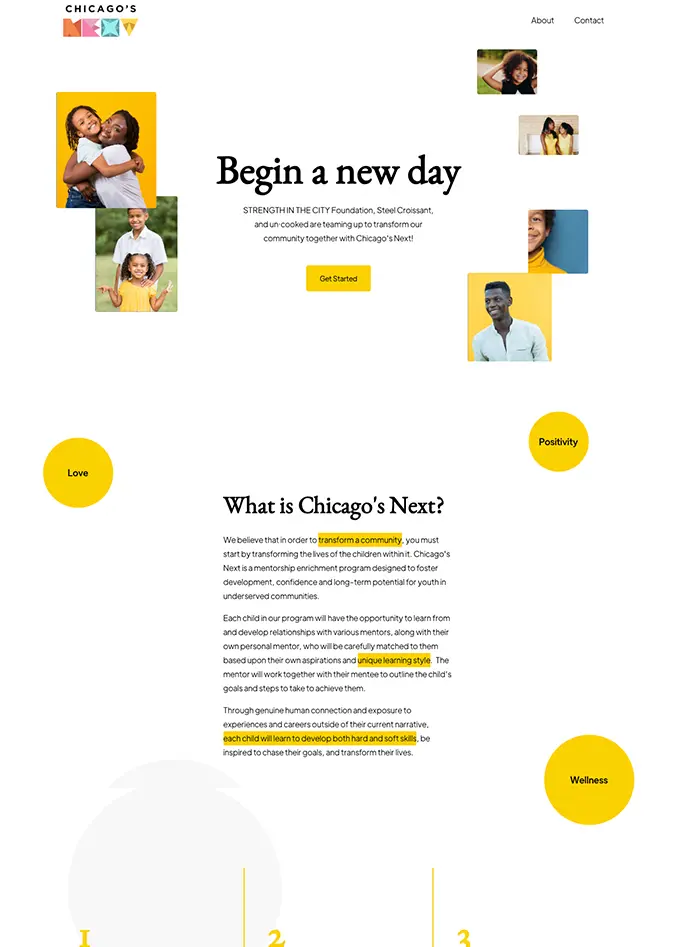
Chicago's Next, a youth mentorship initiative, successfully developed a bold brand identity and responsive website that attract mentors and mentees while clearly outlining program details and application processes. As a result, the program has enhanced its visibility and appeal, establishing itself as a serious yet welcoming initiative supported by partners and funders.

Naansense, a fast-casual Indian-inspired restaurant, successfully repositioned its brand to attract a broader audience through a comprehensive rebranding effort that included a new logo, updated menus, and modernized packaging. This initiative not only enhanced its visual identity but also increased walk-in traffic and social engagement, solidifying its place in the competitive fast-casual dining space.
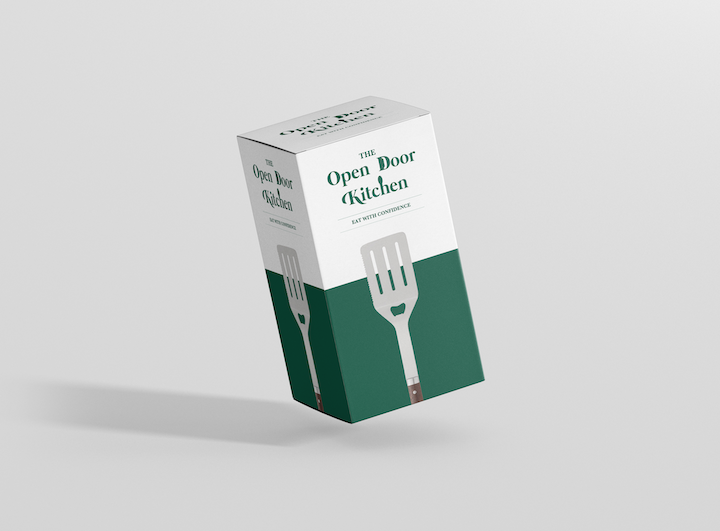
The Open Door Kitchen successfully developed a clever and friendly visual identity for its utensil holders, effectively combining elements of kitchenware and outdoor cooking to appeal to families and grilling enthusiasts. The final logo, featuring an open door and integrated kitchen tools, has been implemented across various platforms, including product packaging and a Shopify storefront, establishing a distinctive and inviting brand personality.
The BioPro Shield project focuses on creating a credible hygiene and protection brand for cleaning products, emphasizing safety and efficacy through thoughtful design and clear labeling. This case study outlines initial identity and packaging explorations that aim to prepare BioPro Shield for retail and professional markets, ensuring a strong market presence and user-friendly experience.
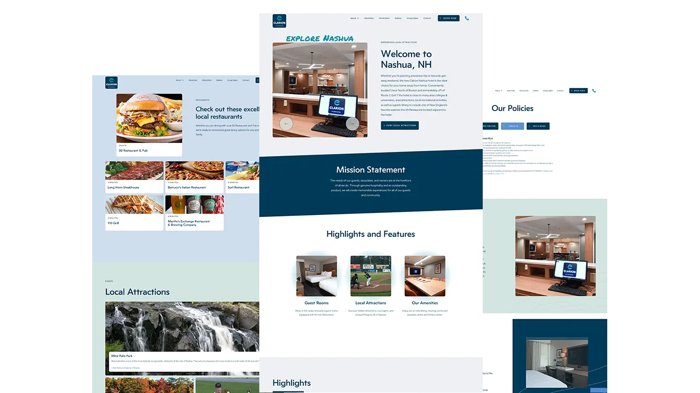
The Clarion of Nashua project successfully redesigned the hotel's website to showcase its remodeled rooms and amenities, enhance direct bookings, and effectively communicate Covid-19 safety measures. Post-launch analytics indicated increased guest engagement and improved visibility in search results, demonstrating the value of a well-structured online presence for hospitality businesses.
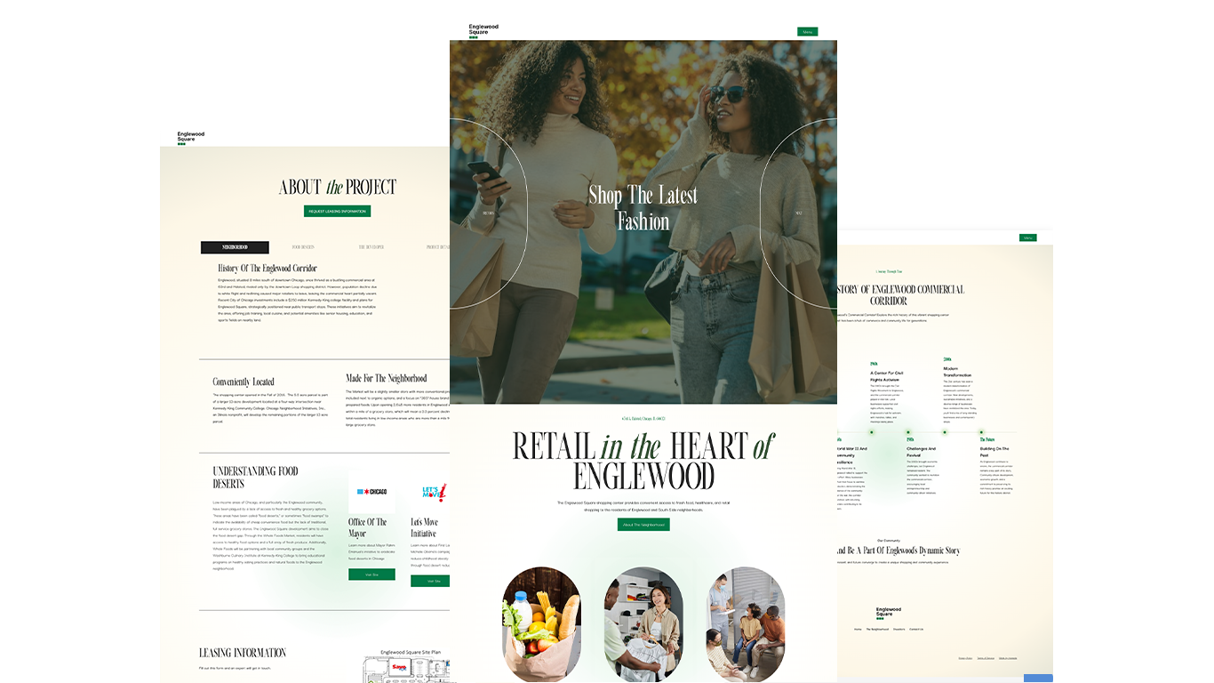
Englewood Square, a 5-acre development in Chicago, aims to address food access issues in the Englewood neighborhood by bringing a Whole Foods Market and additional retail spaces. The project’s refreshed brand and website enhance investor interest and community engagement, framing the development as a catalyst for economic growth and neighborhood revitalization.